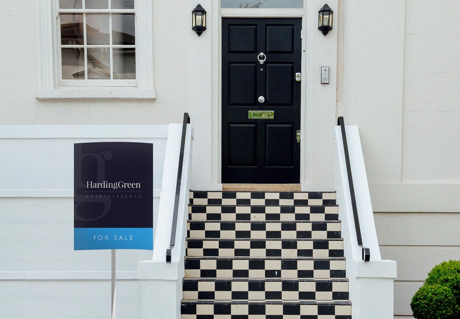


An estate agency operating in the Kensington Chelsea area, Harding Green has a new concept where the major USP is that for clients there is only one point of contact throughout the entire process. To ensure they attract the best agents and customers I needed to create a brand which maintains a traditional image but featured a modern twist as a nod to their new structure.
Creating the brand:
I chose a serif font combined with a wide spaced sans serif font to give contrast and represent the blend of the benefits of experience with new ideas and practices.
The brandmark created from a combination of the H and G letters gives the brand a unique twist and also represents the relationship centric focus of the company.
"Thanks so much for carrying out such amazing work for me."
Nick Carter, Founder of Harding Green