


The client had a strong rationale behind their new name. The concept is that they are distinctive from other financial companies so represent themselves as a yellow stone in contrast with grey stones.
The brief required a strong brand to reflect that they are an unpretentious business. It needed to be simple, honest and fresh, with no over complication.
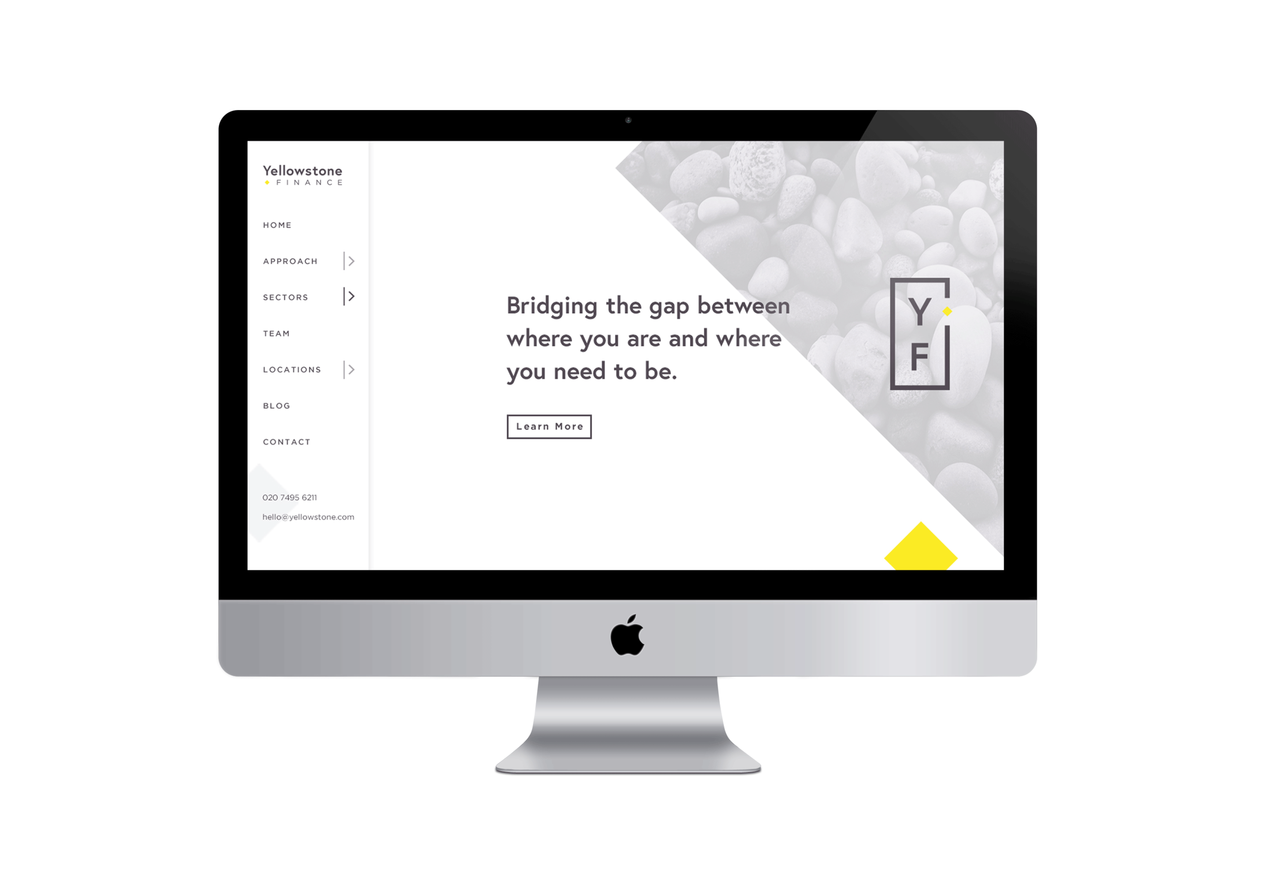
I felt this brand needed a very minimal logo and brandmark which reduced the elements of the company name to its simplest forms.
I chose a diamond shape to break the straight lines of the rectangular housing, draw the eye to the icon and for its traditional associations with inherent value.
I selected a simple serif font and customised it so that the terminals matched the 45 degree angles of the diamond.
The yellow was based on a bright lemon shade to convey that they are a fresh modern company and combined with tonal greys representing other stones, giving the yellow impact.
The website needed to be equally minimal and bold. I used a modern block style to emulate the rectangular shape of the brandmark and added yellow features to each section.